FAQ
When is my team or organization most actively interacting with documents?
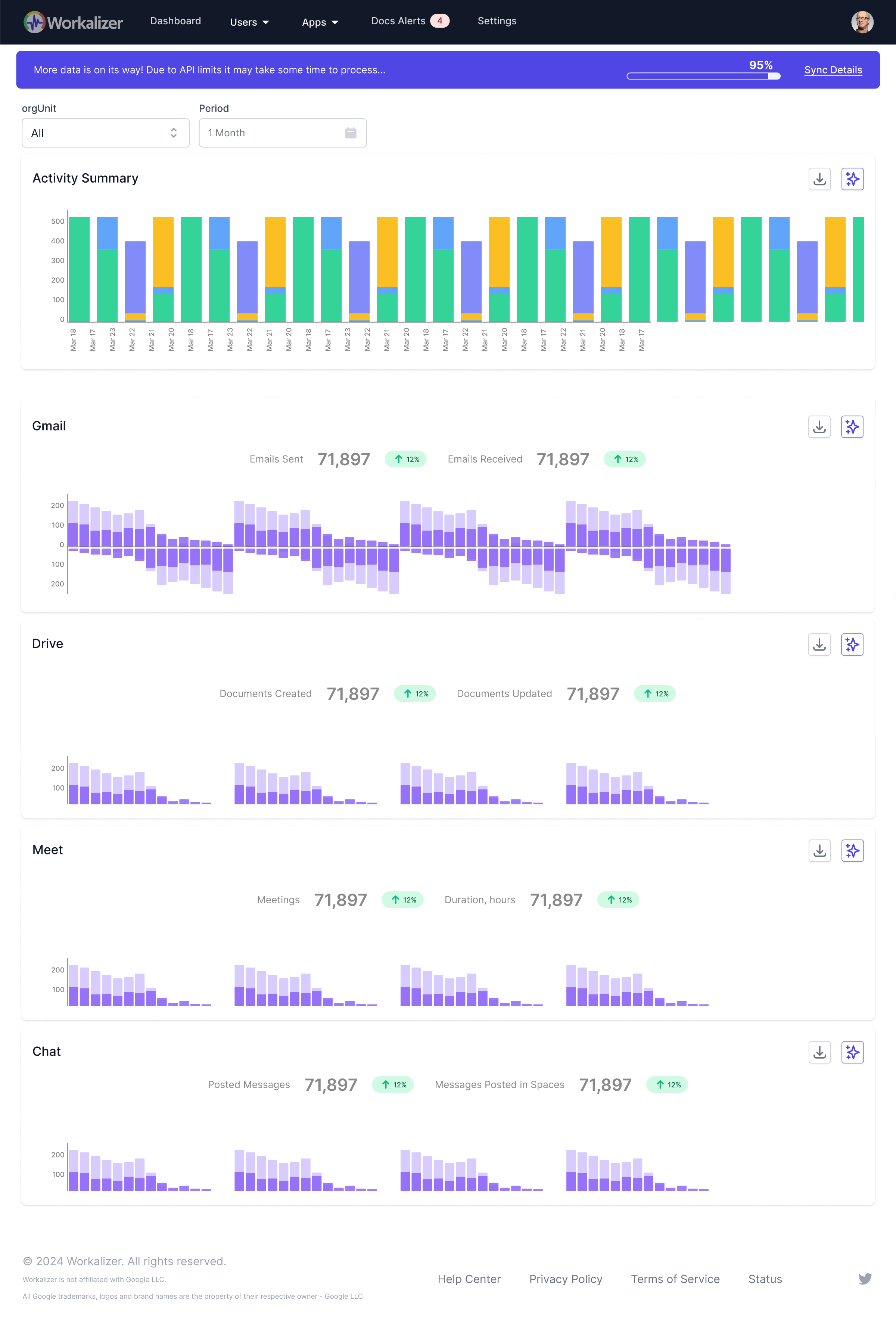
The Documents Bar Chart visually represents document activity over selected periods. By using the 'Period' filter (e.g., 'Week', 'Month', 'Custom'), you can easily identify peaks and troughs in document interactions. Observe the height of the bars to pinpoint specific days, weeks, or months of highest engagement across your team or the entire organization, helping you understand work rhythms.

