FAQ
How does my activity distribution compare to the team average?
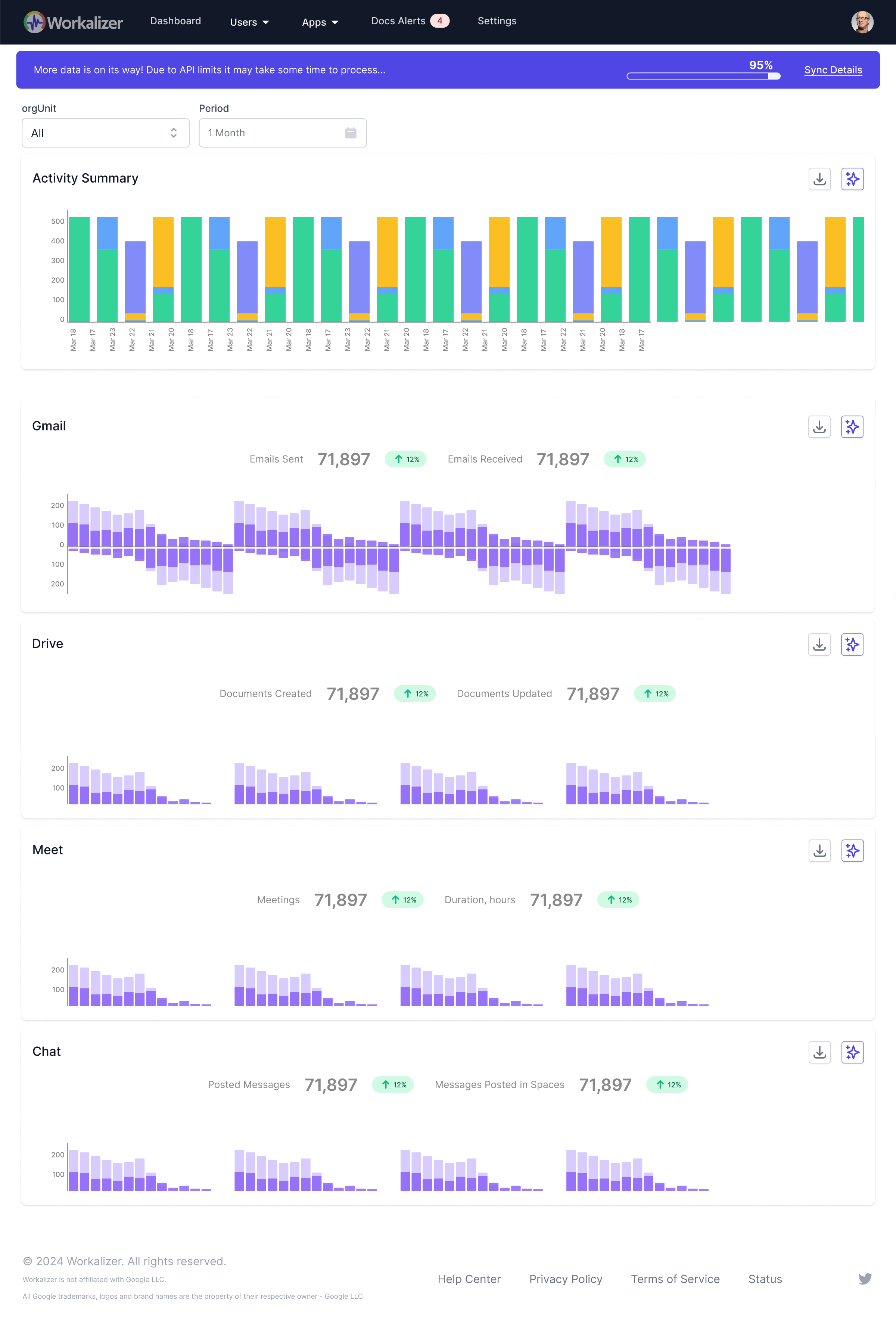
To compare your activity distribution, first filter the widget by 'User: Me' to see your personal data. Then, change the 'User' filter to 'My Org Unit' or the relevant team to view the aggregate team data. You can then visually or numerically compare the distribution of activity labels and types to understand how your patterns align with or differ from your team's average. This feature supports personal development and helps in team alignment and understanding best practices.

