FAQ
Are we receiving significantly more emails than we are sending, or vice-versa?
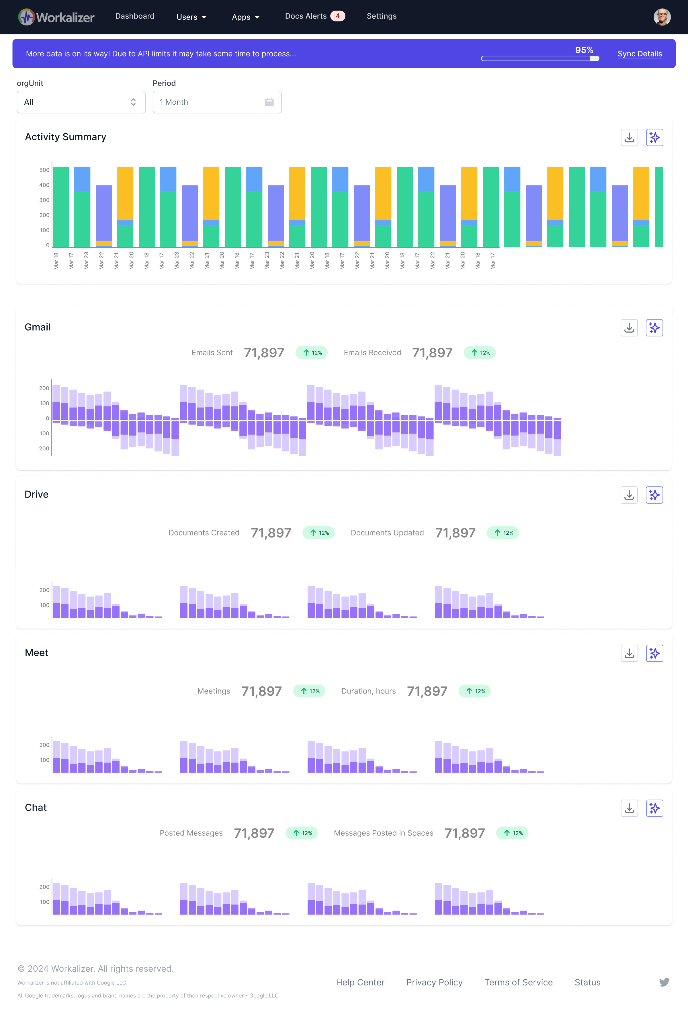
The bar chart in the Gmail Usage Trend widget clearly distinguishes between 'Emails Received' (blue bars) and 'Emails Sent' (green bars). By comparing the heights of these bars for any given period, you can quickly assess the balance. A significant disparity immediately highlights if your team or organization is primarily a receiver or sender of email, helping to understand communication flow and potential imbalances.

