How to Use the Gmail Usage Report
The Gmail Usage Report in Workalizer shows how your organization uses email: volume of messages sent and received, grouped by time period, with trend comparison to the previous period. Use it to monitor communication load, spot seasonal patterns, and balance adoption across teams.
Who Benefits
- Team Leads and Department Managers: To see email volume and sent-vs-received balance for their org unit and compare over time.
- HR and Operations: To assess communication intensity and alignment with remote or hybrid policies.
- Executives: To track organization-wide email trends from the Dashboard or Apps without opening individual reports.
Widget Access
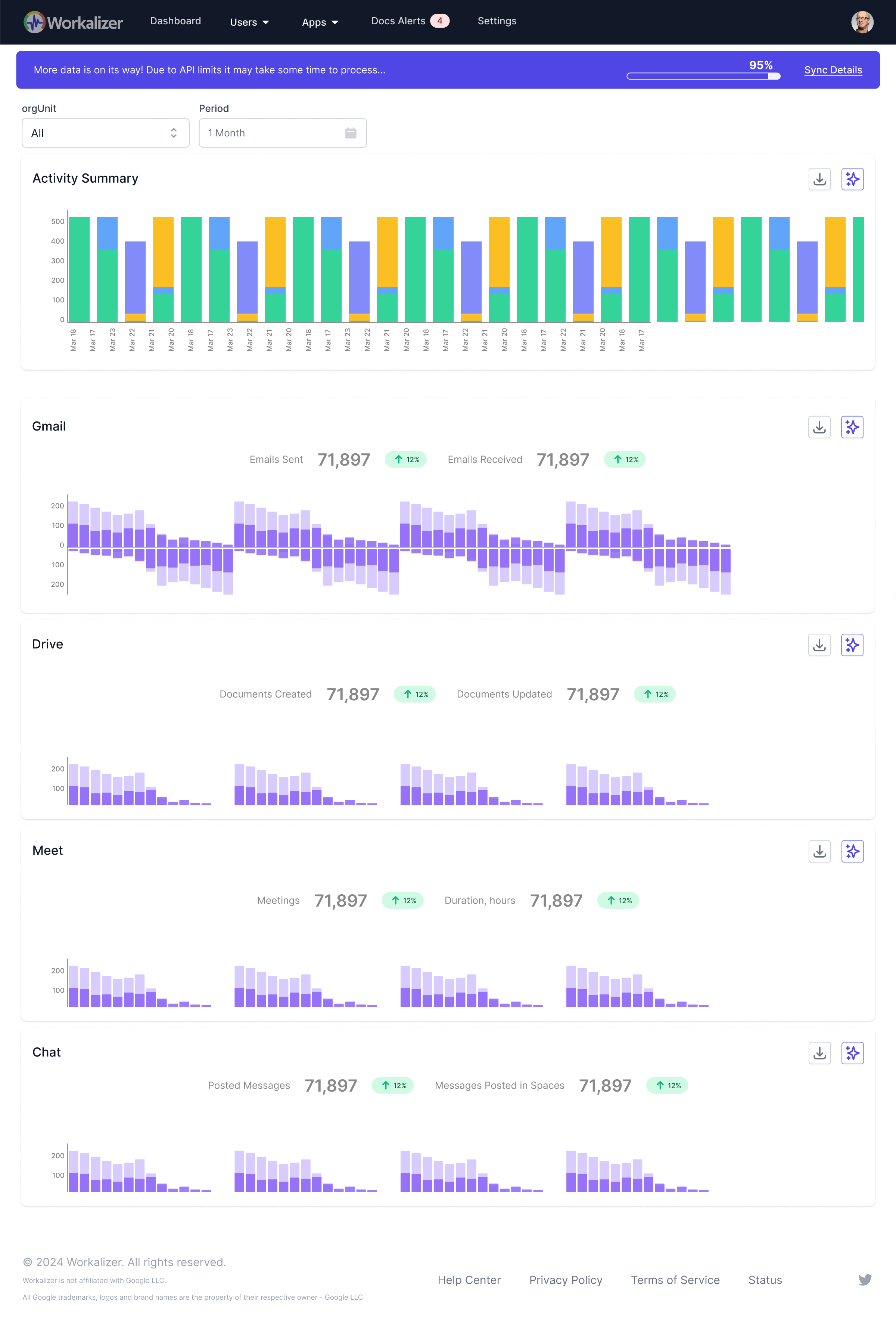
You can see Gmail usage in two places: (1) On the main Dashboard (/dashboard/), the Gmail Activity Chart shows a high-level comparison of emails sent vs received. (2) For a dedicated view, go to Apps > Gmail tab to access the full Gmail Activity widget with the same metrics and filters. Use Org Unit and Period at the top to scope the data.
Detailed Functionality
The report displays a bar chart (or equivalent) comparing Emails Sent and Emails Received by time bucket (e.g. by week or month). Trend indicators show percentage change versus the previous period. You can switch between org units to compare departments or view the whole organization. Use the chart to identify peaks in sending or receiving and to correlate with User Initiated Communication and User Received Communication in Performance Review for per-user detail.
Step-by-Step Guide
- Open Apps > Gmail (or Dashboard): From the main nav, go to Apps and select the Gmail tab, or use the Dashboard for a summary.
- Set Org Unit and Period: Choose the Org Unit (e.g. All or a specific department) and Period (Week, Month, 3 Months, Year, or custom range).
- Read the chart: Compare the bars for Emails Sent vs Emails Received; note the trend percentage to see if volume is rising or falling versus the previous period.
- Drill down (if available): Hover over bars or data points for exact counts; in Performance Review use Sent vs Received Ratio for per-user balance.
- Use AI Insights: If the widget offers AI Insights, click it for a short summary or recommendations based on the current data.