FAQ
Frequently asked questions about activity analytics, Gmail and Chat metrics, performance reviews, document alerts, and Google Workspace insights.
What are the daily activity patterns for users or teams?
The Daily Activity Heatmap visually displays daily activity patterns for individuals or teams as a grid of colored squares. Each square represents a day, a…
Are there specific days with noticeably higher or lower activity?
Yes, the Daily Activity Heatmap is designed to highlight specific days with noticeably higher or lower activity through its color intensity. Darker shades …
How has an individual's or team's activity changed over time?
By selecting different periods (e.g., Week, Month, Year, or Custom) within the Daily Activity Heatmap, you can observe how an individual's or team's activi…
What trends are emerging in daily work habits?
The Daily Activity Heatmap, especially when viewed over longer periods, helps identify emerging trends in daily work habits. This could include shifts in p…
What AI insights are available regarding the observed activity patterns?
The Daily Activity Heatmap features an 'AI Insights' button that provides intelligent, AI-generated analysis and actionable recommendations. These insights…
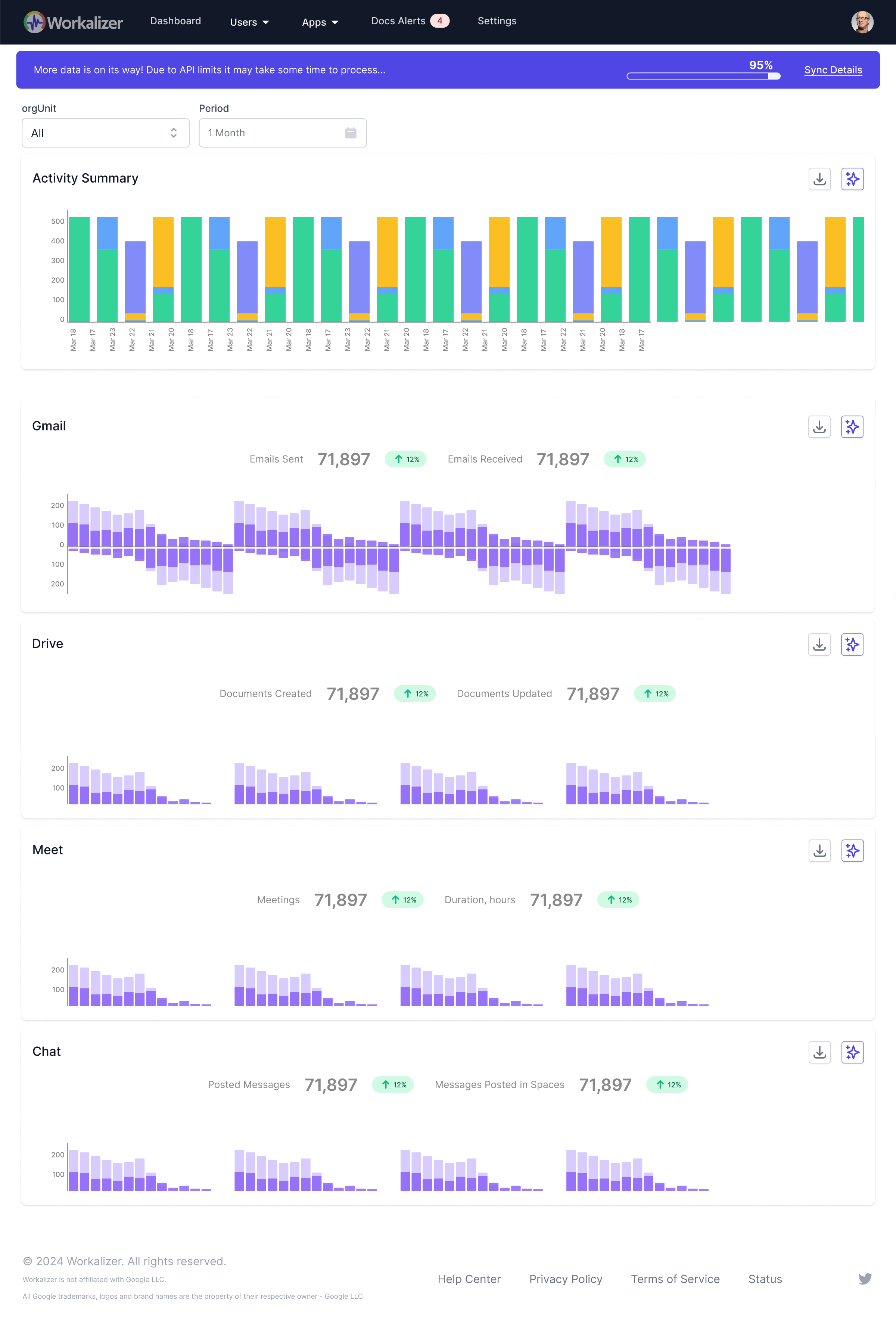
What is the historical trend of meeting attendance and skipped meetings within my team or organization?
The widget displays a stacked bar chart for selected time intervals, showing both attended and skipped meeting durations. For each interval, it presents tw…
How does the current meeting attendance rate compare to previous periods?
The widget is specifically designed for this comparison. For every selected time interval (e.g., a week or month), two adjacent bars are displayed: the rig…
Are there specific periods where meeting attendance is consistently lower?
Yes, by utilizing the 'Period' filter (Week, Month, 3 Months, etc.) and observing the stacked bar chart, you can easily identify consistent patterns. For i…
Which organizational units or users have the highest/lowest meeting attendance rates?
You can determine this by using the 'Org Unit' filter to view attendance for 'All', specific departments, or 'Users without org unit'. Additionally, the 'U…
What are the AI-generated insights regarding my team's meeting attendance patterns?
By clicking the 'AI Insights' button within the widget, you'll receive intelligent analysis and data-driven recommendations. These insights go beyond raw d…
How to See Average Workday Start/End Times?
The Team Workday Alignment widget displays average start and end times as a bar chart. Select your desired period (e.g., Week, Month) using the filters, an…
How Workdays Vary Over Time?
The widget allows you to select different periods like 'Month', '3 Months', '6 Months', or 'Year'. By viewing the bar chart over these extended periods, yo…